Pinus Boutique
Website Design — Thoughtful booking experience
UX/UI Design
Visual Design
Brand Direction
Copywriting
Framer

Overview
Pinus Boutique is an independent hotel in Hoi An, Vietnam, where most of its bookings are made through platforms like Booking.com and Agoda. While these platforms provide visibility, they limit brand expression and take a percentage of each booking.
The goal of this project was to design a website that could both communicate the hotel’s unique identity and support direct bookings.
As the UX/UI Designer, I owned the full process from concept through high-fidelity design, and built the website in Framer.
Type
Contract
Role
UX/UI Designer
Date
2026
Live Site
Tools
Figma, Claude Code
Deliverables
High-fidelity designs
Interactive Prototypes
Build in Framer
Problem
The business relied heavily on booking platforms like Booking.com and Agoda, which charge commission on every booking and present properties in a standardized format.
For guests, this lacks emotional connection and clear differentiation between listings. For the hotel, it limits both brand expression and control over the booking relationship.
Pinus Boutique needed a website that would help reduce their reliance on booking platforms, create a more personal experience for guests, and provide a simple way to book a stay.
Design Process
I started my process by understanding the hotel’s story, the owner’s background, their existing guest profile, and what success for the website would look like.
Key insights:
Guests choose Pinus Boutique for its authenticity and personal feel, not for a standardized hotel experience
Most communication already happens through WhatsApp, both before and during the stay
The primary business goal was to increase direct bookings while retaining full margin
The opportunity was to design around existing behavior: direct messaging for bookings and guest inquiries.
Design Principles
I defined three principles to guide my design decisions:
Warm and Personal
The experience should feel like a letter from the owner, not a platform listing. Copy and layout emphasize warmth and clarity.Less is more
A clean, editorial aesthetic with generous whitespace. The design lets the content and photography stand out.One clear next step
Each screen has a single primary CTA, guiding users forward without competing actions.
User Flow & Structure
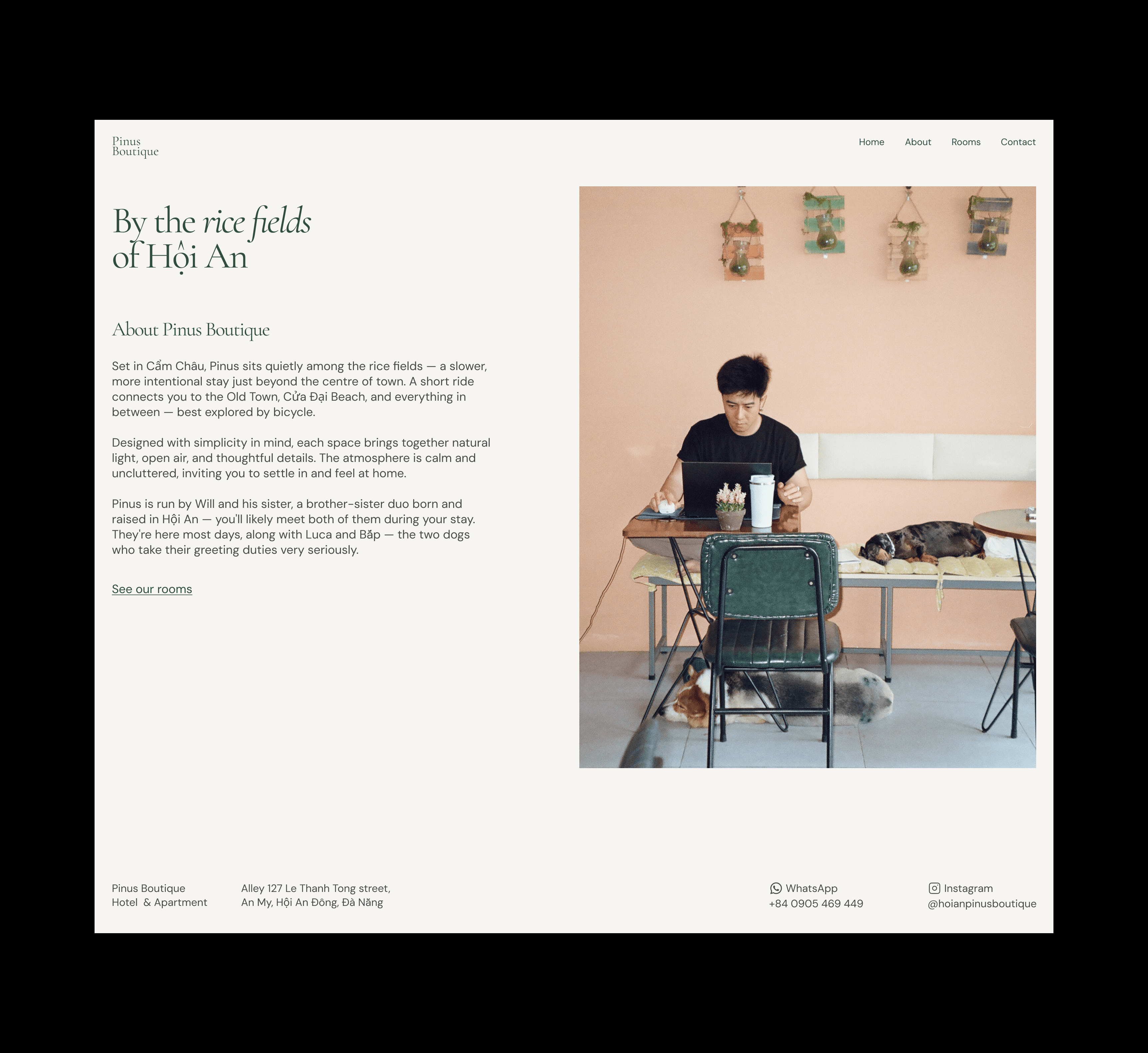
The website is built around four screens that mirror the decision journey of a traveller considering a boutique hotel: arrive and feel the brand, understand the story, explore the rooms, then make contact.
Each screen has a single primary CTA that moves the user forward. For high-intent visitors, the landing screen also provides an immediate “Book your stay” action, allowing users to skip the flow and open WhatsApp directly.
All conversion paths lead to WhatsApp, creating a more personal and direct booking experience.

Wireframing and Prototyping
I created mid-fidelity wireframes to establish layout and information architecture. I defined what each screen needed to communicate, in what order, and how to guide attention through the page.
Once the structure was set, I moved into high-fidelity design. I used whitespace and photography-led layouts to create a calm, grounded feel. I paired serif and sans-serif typography for warmth and readability, and used a neutral, earthy palette. I used AI tools to explore initial copy, then refined the content to align with a tone that felt warm and personal.
The result balances emotional storytelling with a clear path to action.

Outcome
The final design reflects the hotel’s identity while supporting its primary goal: reduce reliance on booking platforms and increase direct bookings. The client noted that the site felt more curated and easier to navigate than their listing on Booking.com, and had a clear sense of personality and quality. Since its launch, it has supported direct guest inquiries and bookings.
The Pinus Boutique website is a simple but intentional experience that turns interest into conversation, and conversation into booking.



Reflection
The project was constrained by the lack of a traditional booking system. Instead of working around it, I designed the experience around direct communication through WhatsApp, resulting in a simpler, more personal booking flow.